Nikkol Group — Multi-platform Corporate Materials
Name any famous cosmetics brand—chances are their products include raw materials developed, tested, and produced by the Nikkol Group companies.
For their new website and corporate materials, Nikkol Group wanted to focus on their Japanese roots instead of industry clichéd fashion/cosmetics images. We created original photography that tied their brand values with traditional Japanese culture to express the true spirit of Nikkol Group’s strengths.
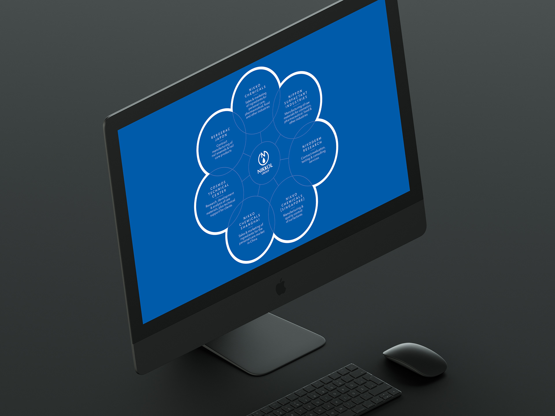
PowerPoint Presentation
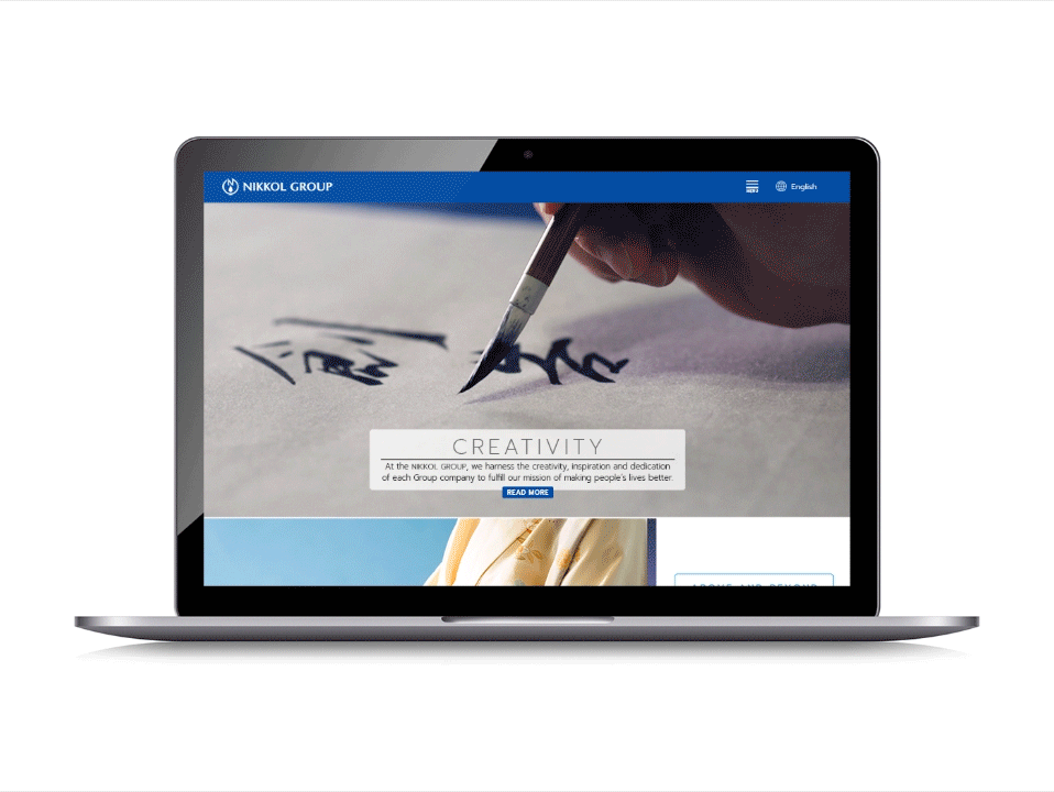
Website Design
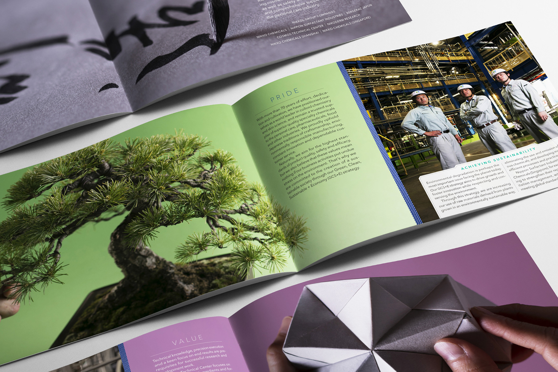
Printed Brochure
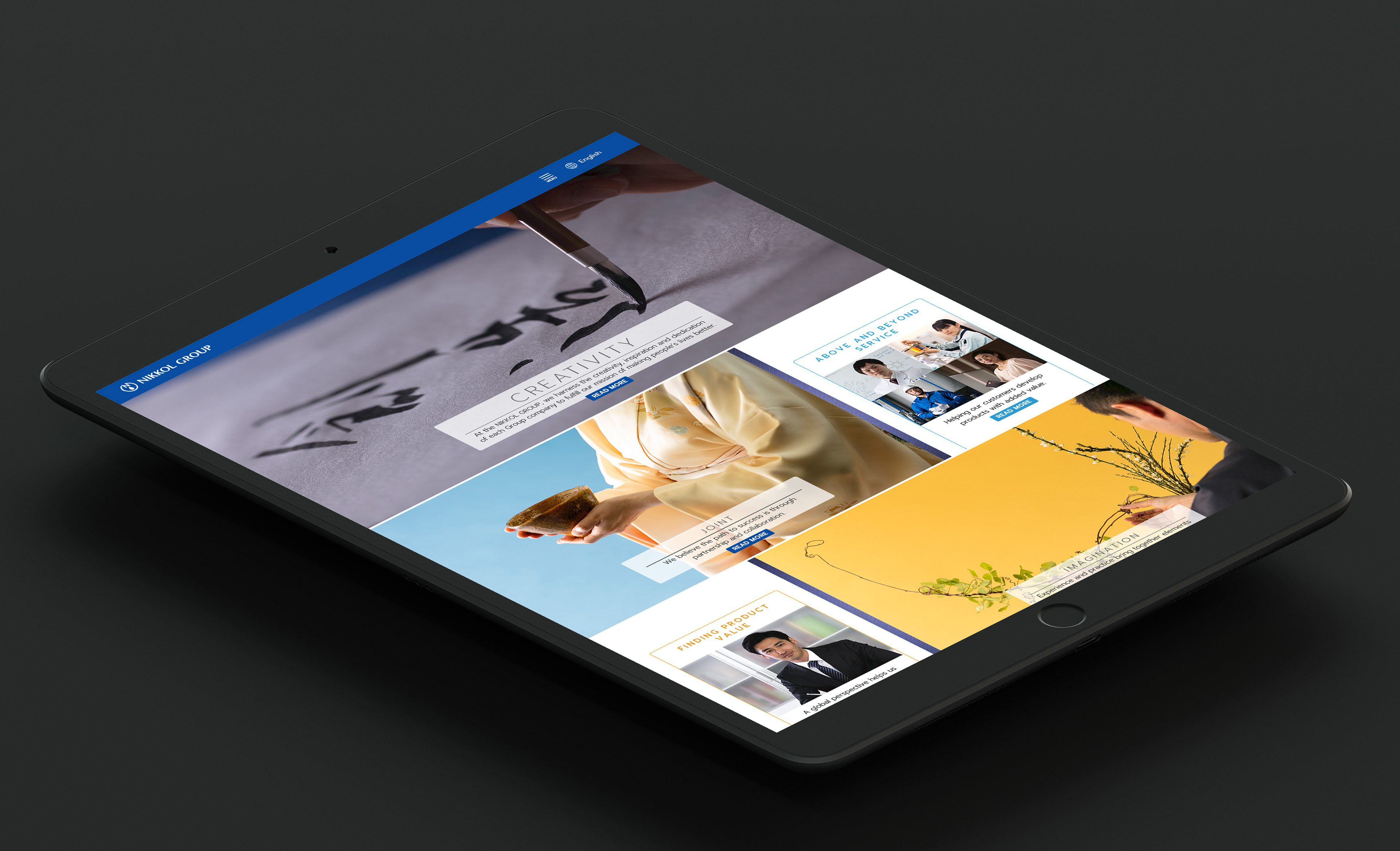
Website Tablet Version
Brand Logo Collection
Reischauer Center — East Asian Studies

Learning English through the magic of books
Ultra-strong glass, born from fire
Advanced, environment-friendly power solutions
Cleadew — Package Design Refresh
Cleadew is a contact lens cleaning and disinfection solution made in Japan by Ophtecs.
Original rebranding saw a significant market share increase. Ophtecs wanted to continue their forward momentum with a package design refresh.
The refresh strengthens the cleadew brand with a more cohesive look throughout the product line and creates a robust in-store presence with category-unique graphics and colors.
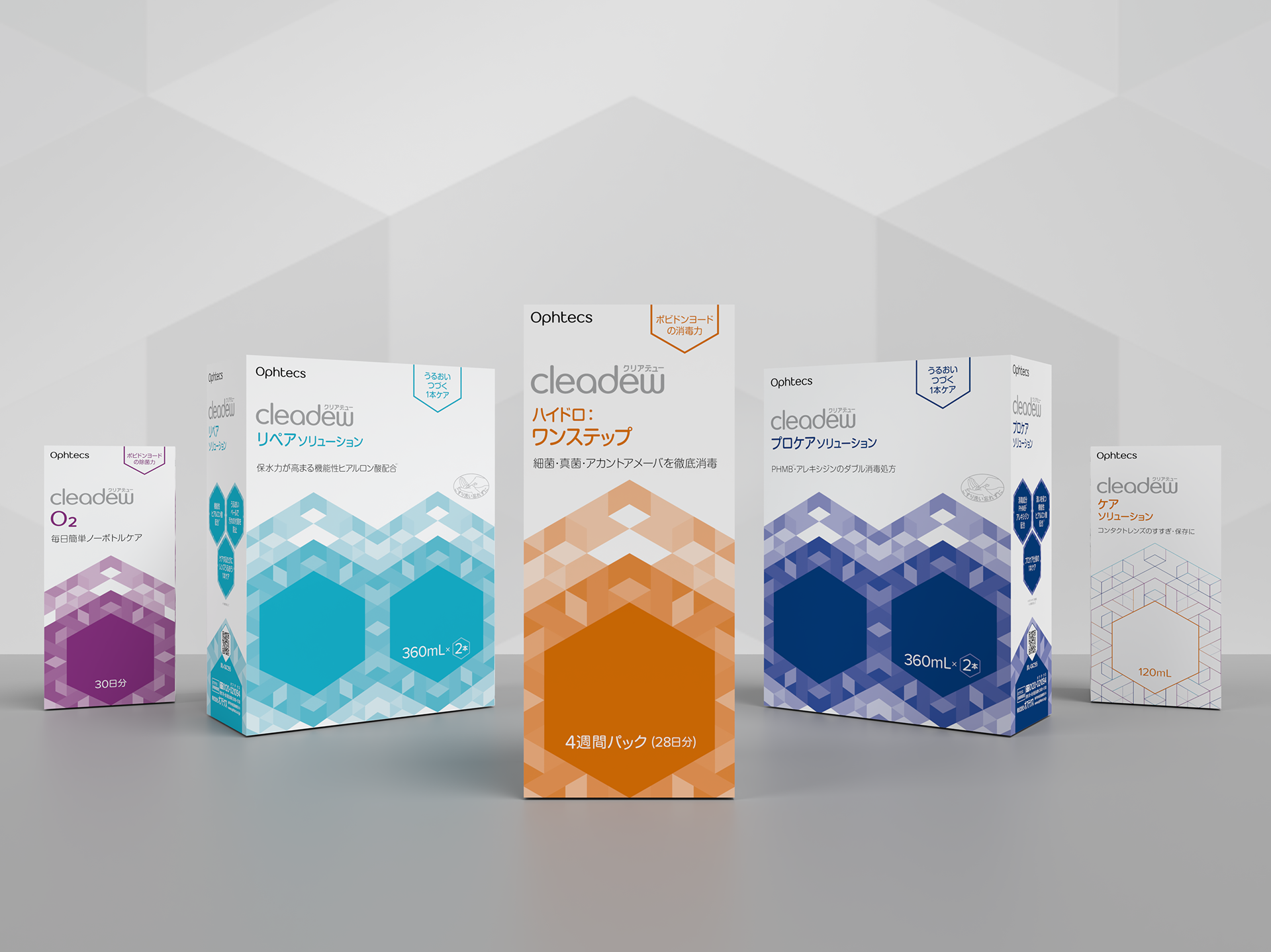
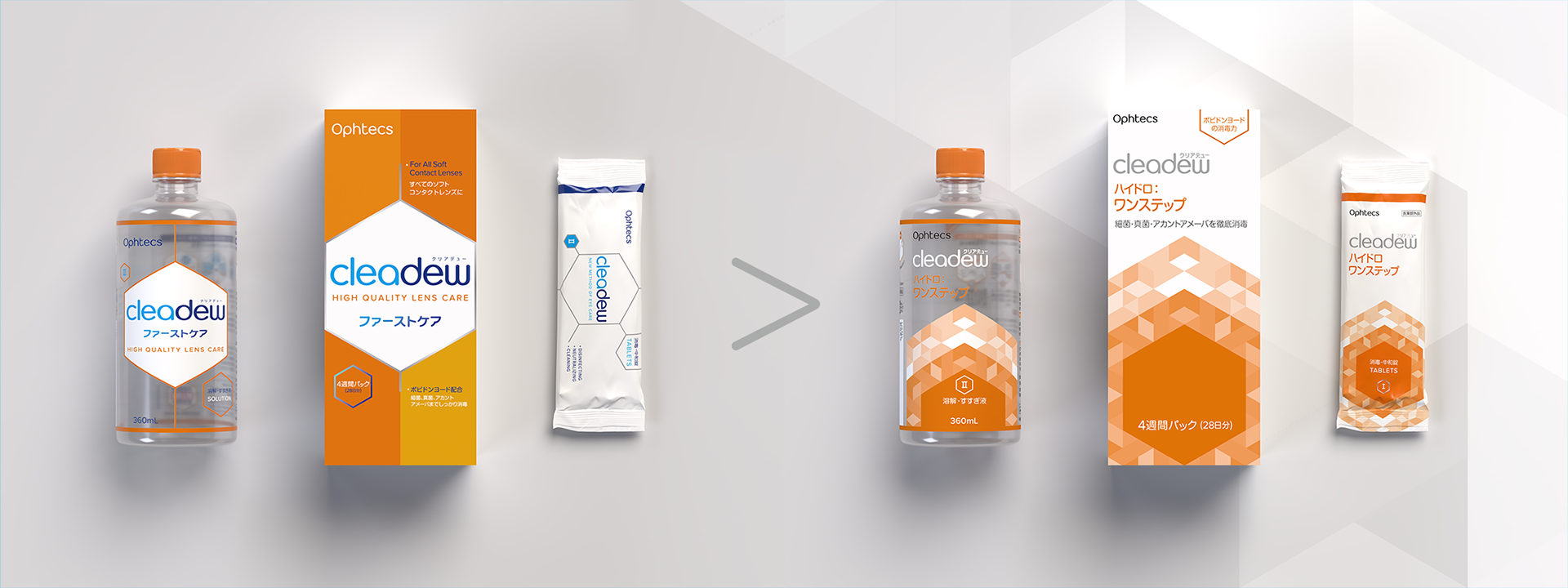
Before > After
Original font logotype
Original font logotype
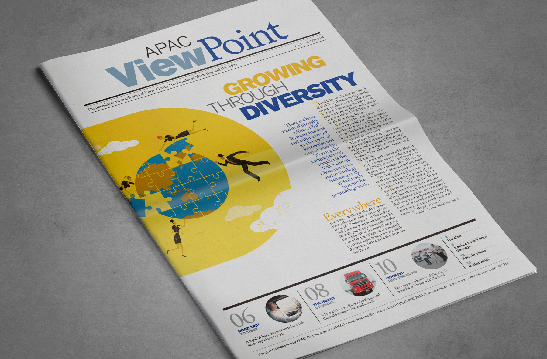
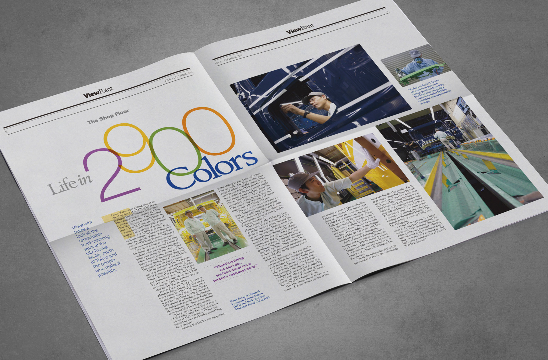
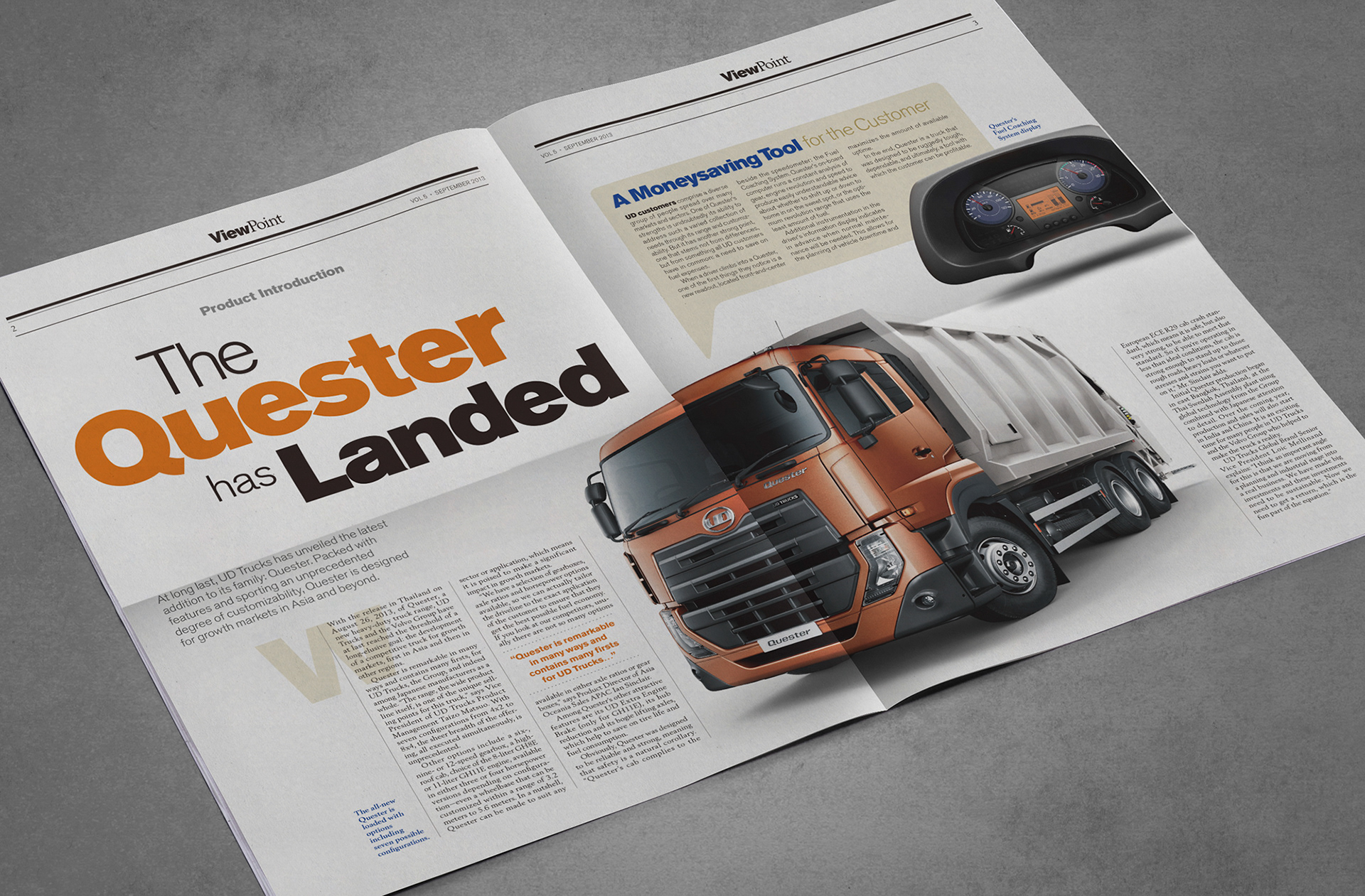
Volvo Trucks APAC Newsletter
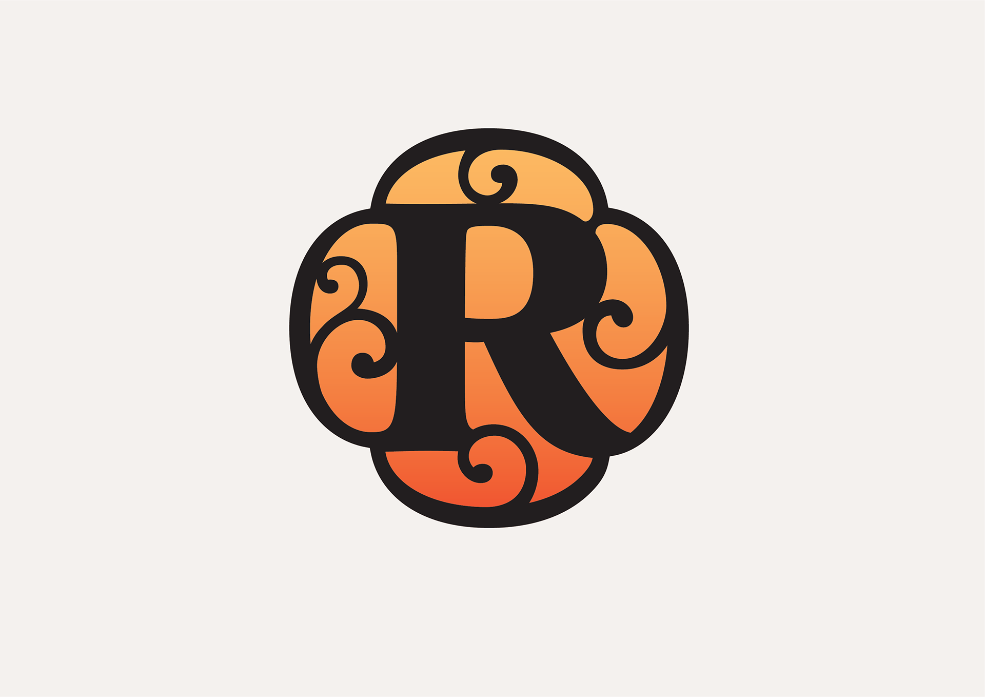
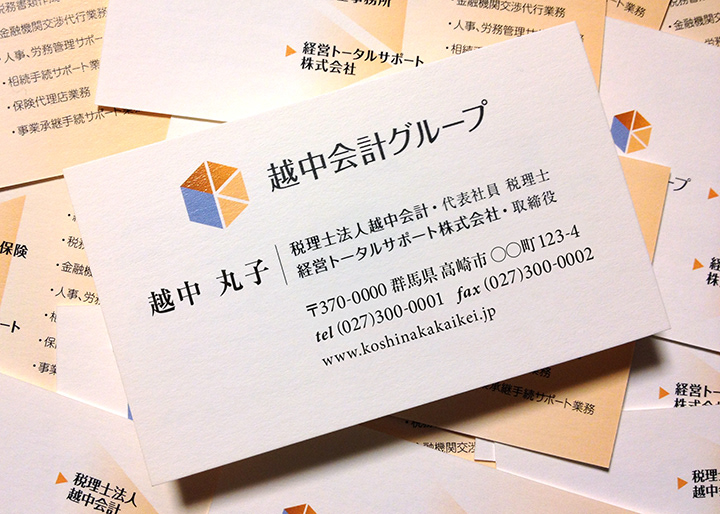
Koshinaka Accounting Group — Logo Mark
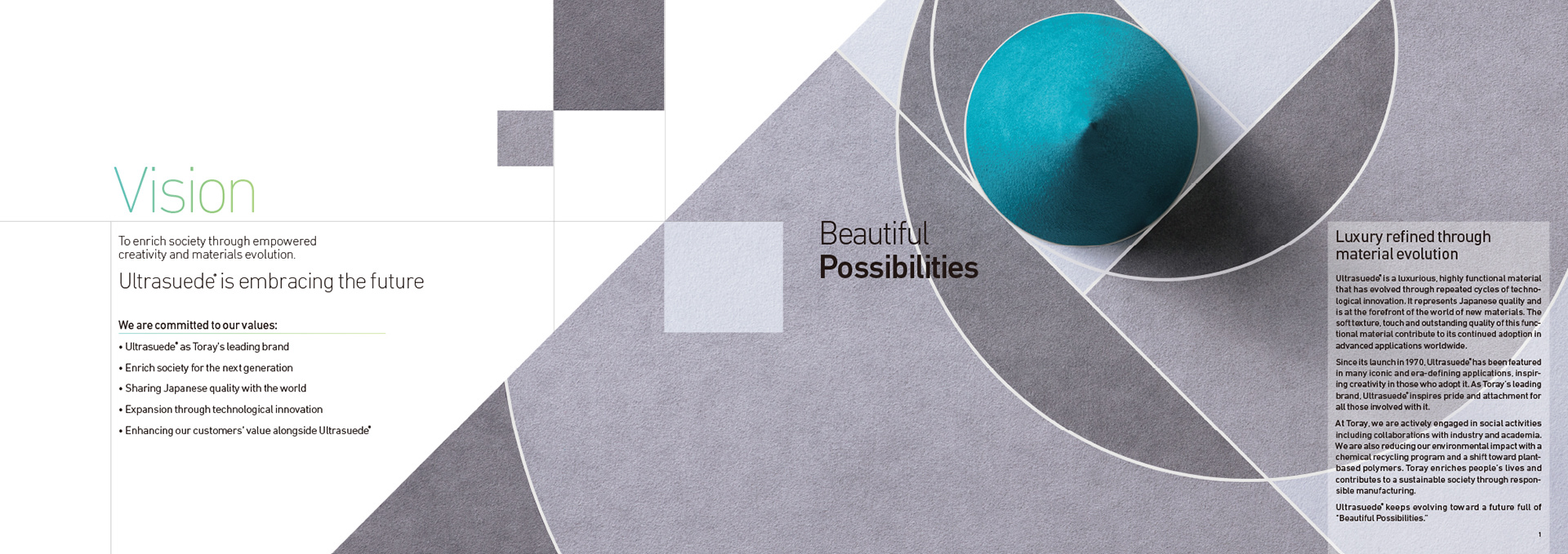
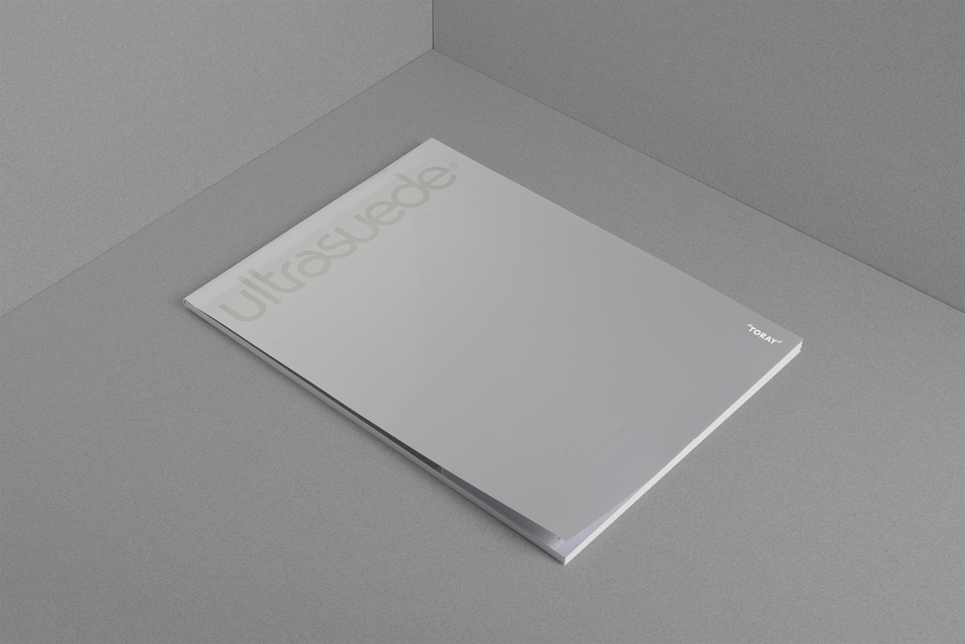
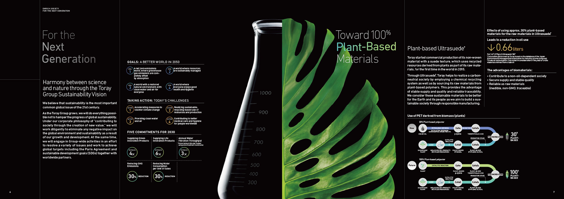
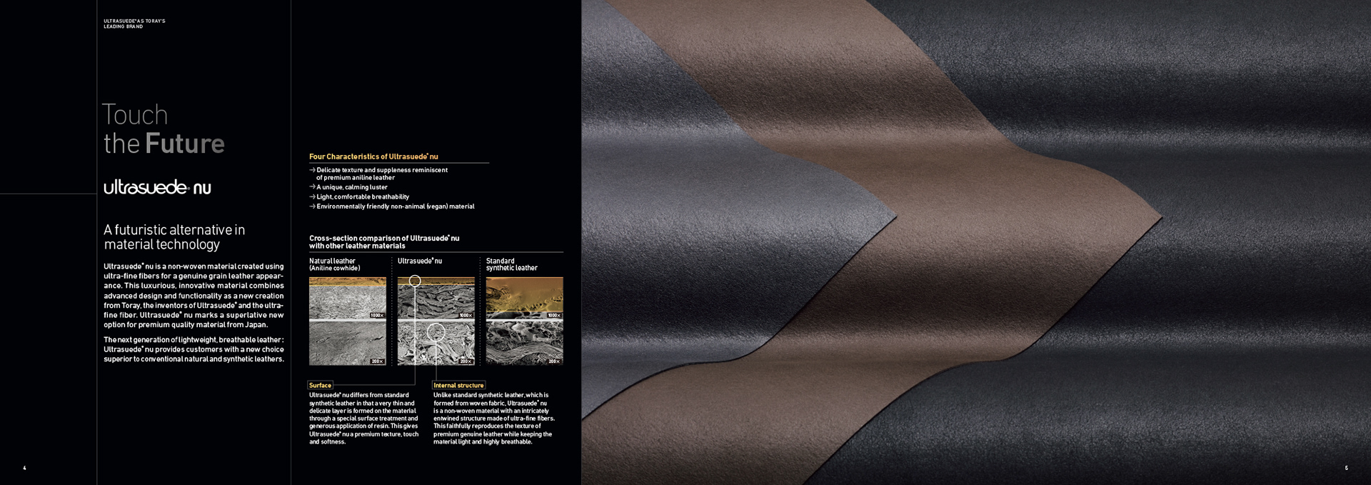
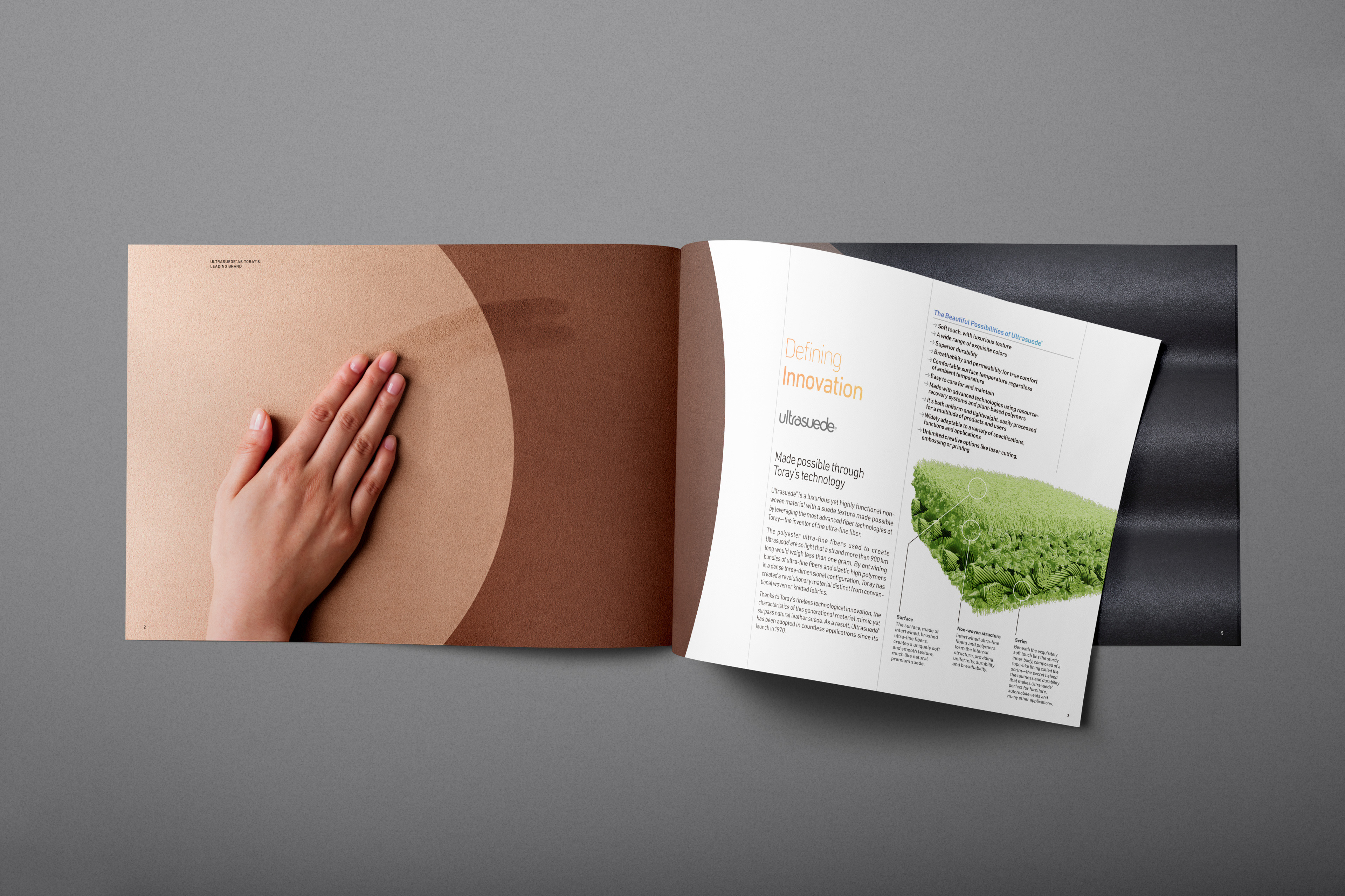
Ultrasuede — Product Brochure
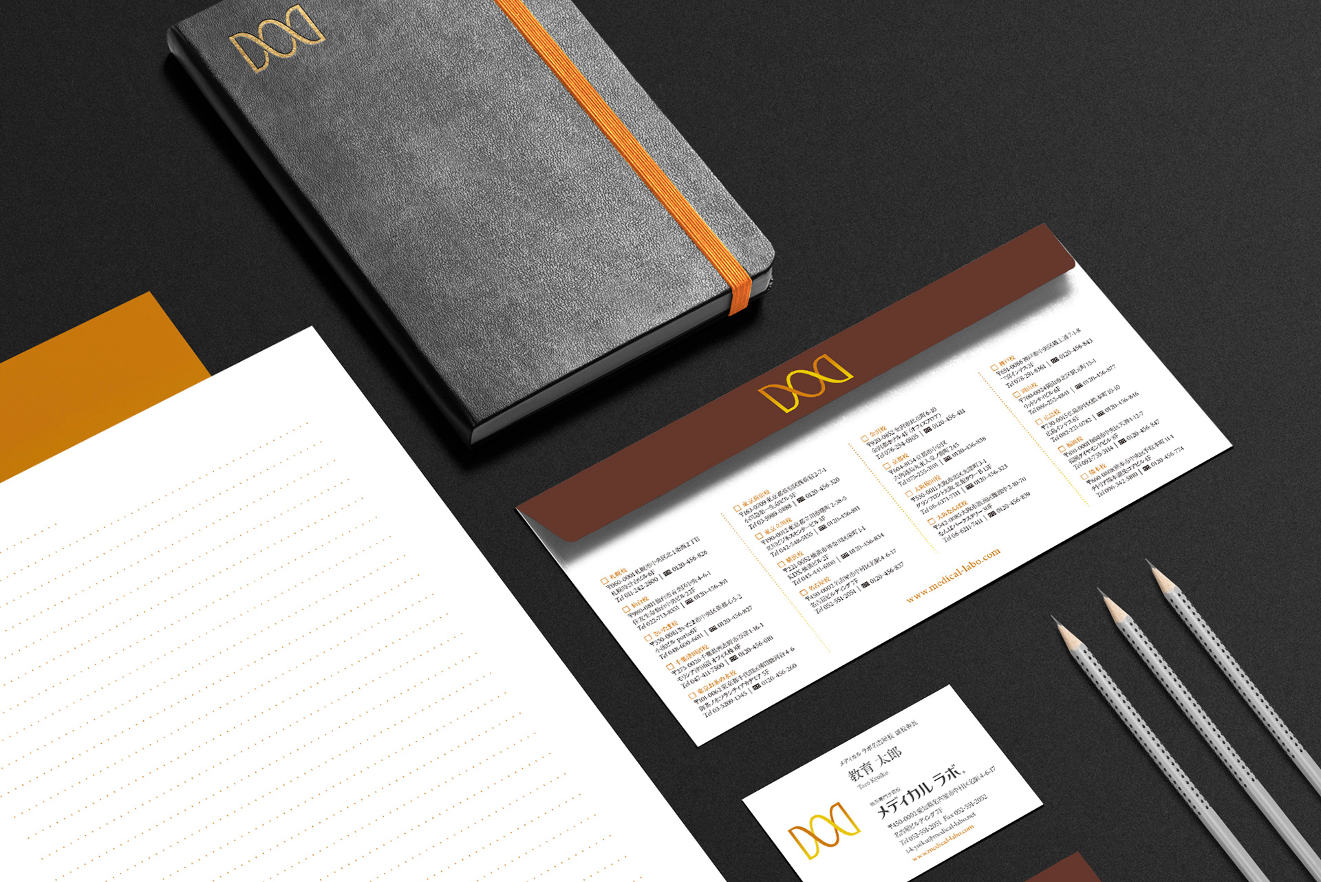
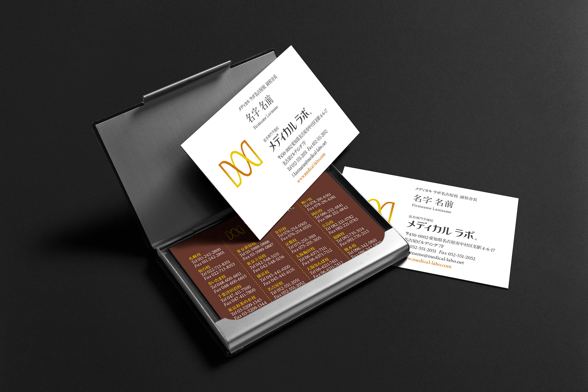
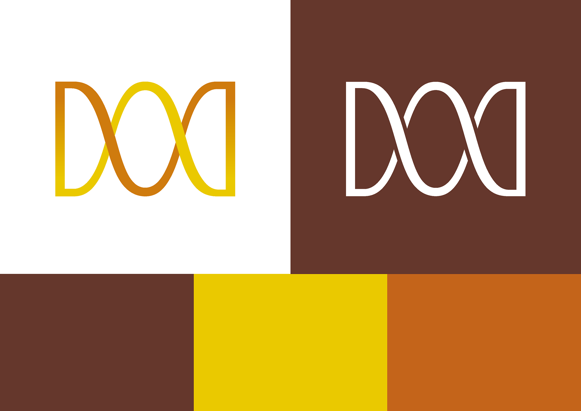
Medical Labo — Brand Identity
Getting into medical school is no easy task. In Japan, due to strict once-a-year enrollment rules, students must pass their entrance exams or wait another year to try again.
Enter Medical Labo—a prep school created explicitly for medical university hopefuls. Medical Labo designs a curriculum uniquely tailored to each student. All classes are taught in a 1:1 student-to-teacher ratio for maximum learning and success.
The Medical Labo brand mark combines the initial letter “M” and a representation of a double helix with hints to the 1:1 student ratio that makes Medical Labo unique.


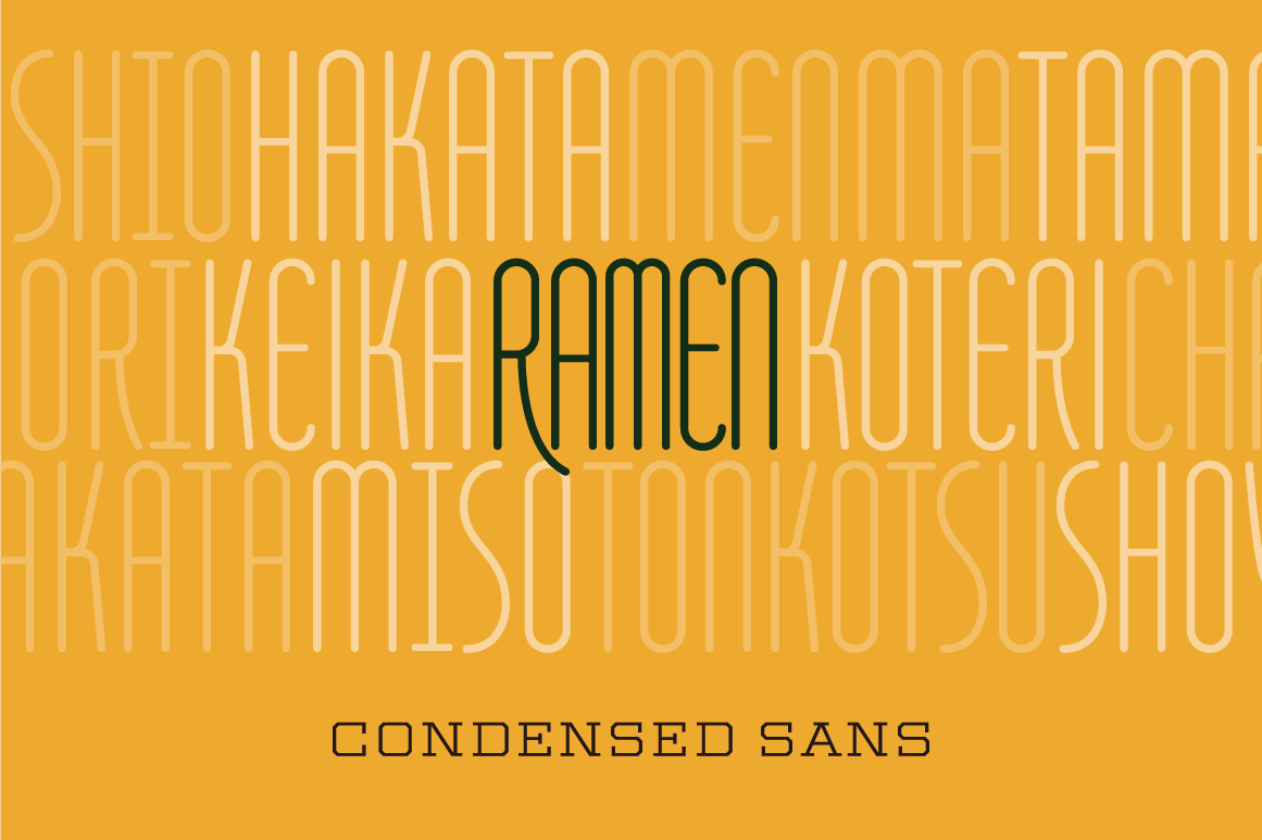
Original Font—“Ramen”
Thank you for your time