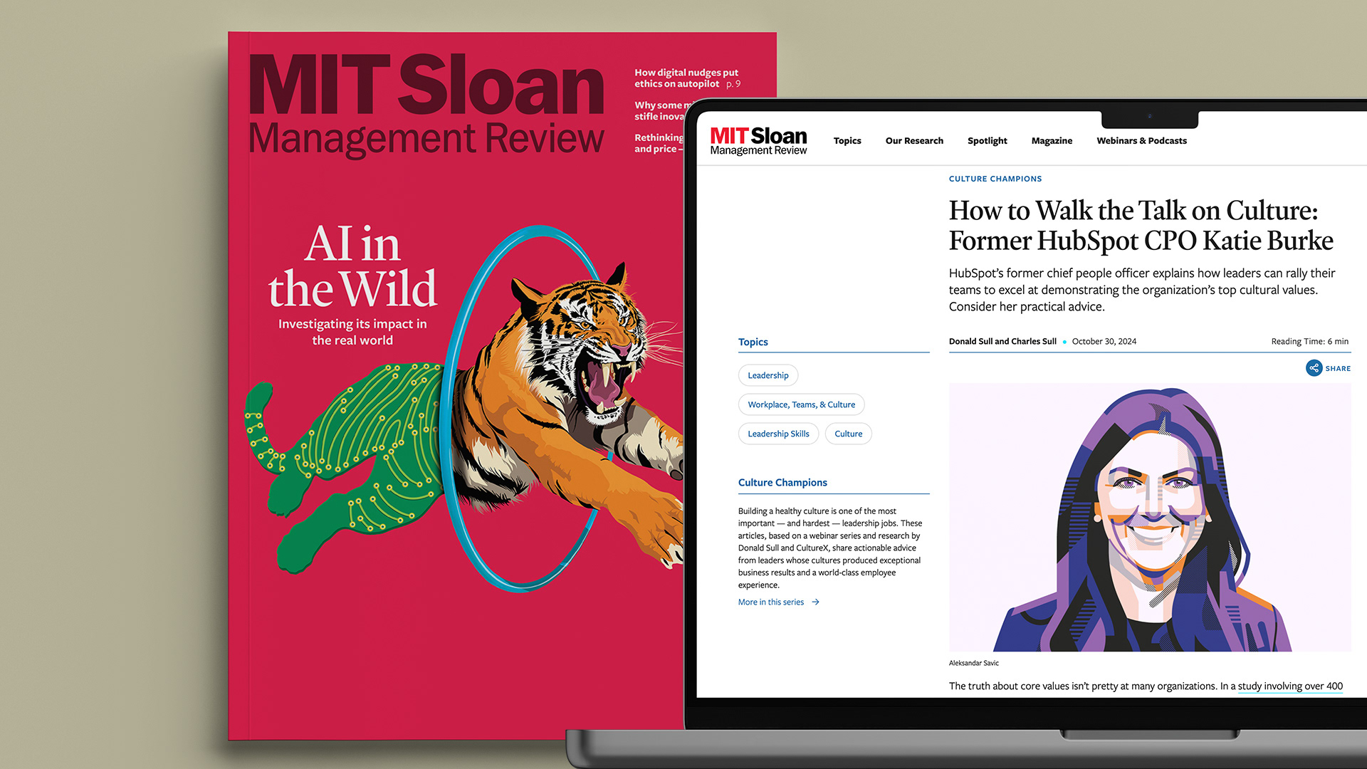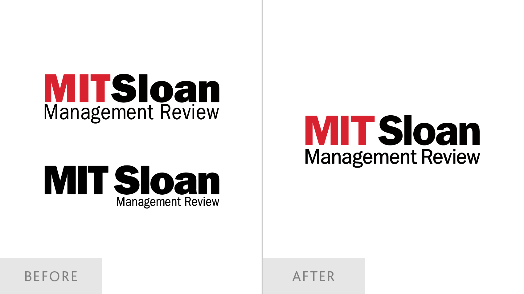
Different versions of the logotype were used for digital and print media, resulting in an inconsistent brand experience. Inconsistent spacing — overly loose online, overly tight in print — compromised clarity and legibility. The heaviness of letterforms contributed to a dated feel.

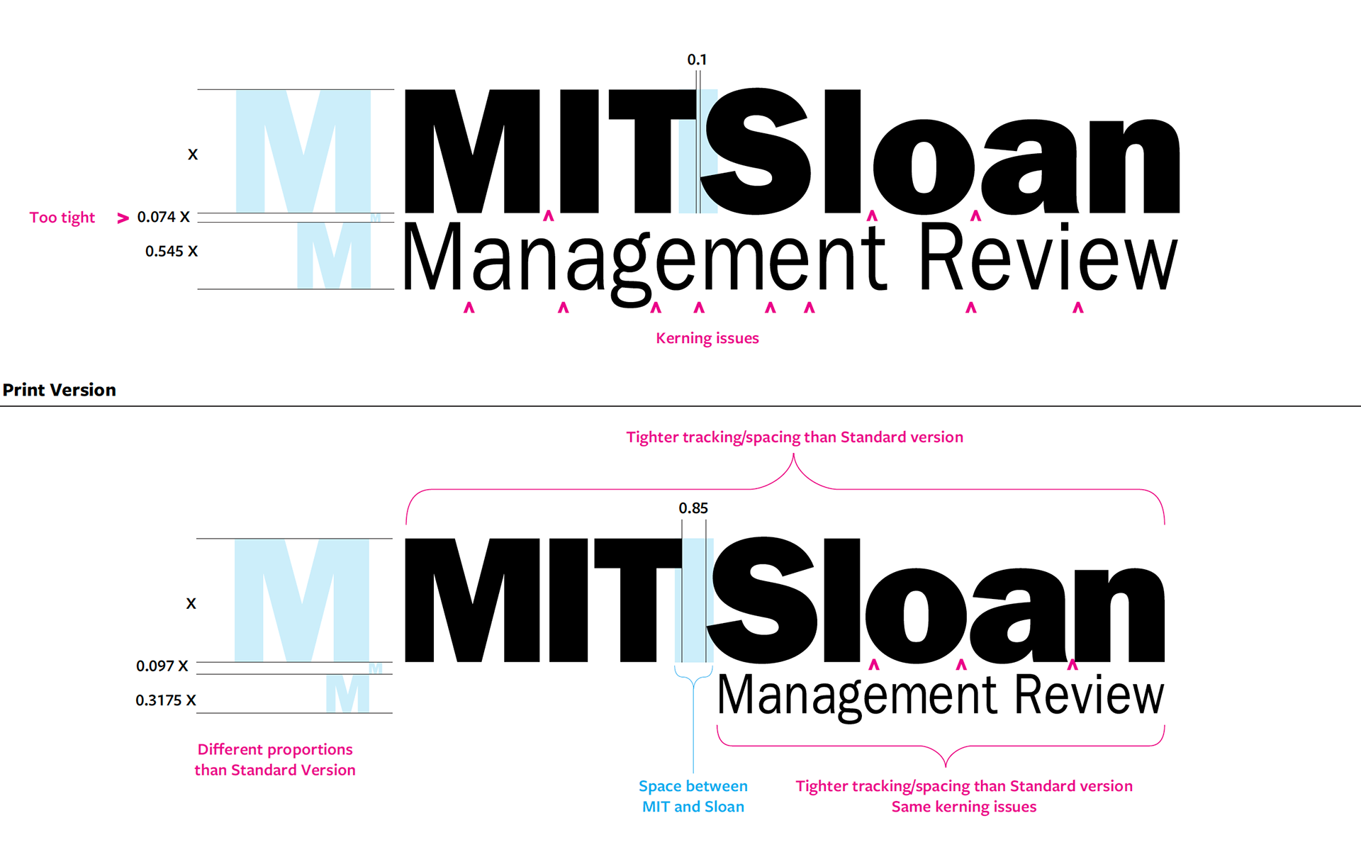
Annotated comparison of the original logotype versions (spacing, kerning, layout differences).