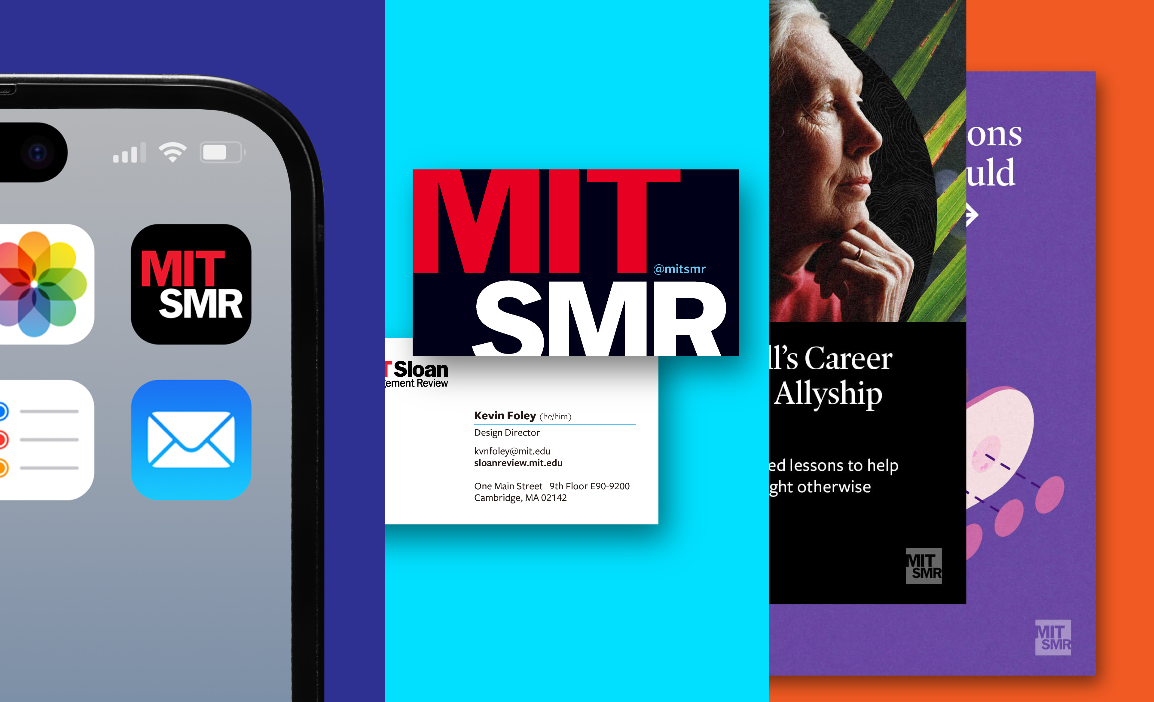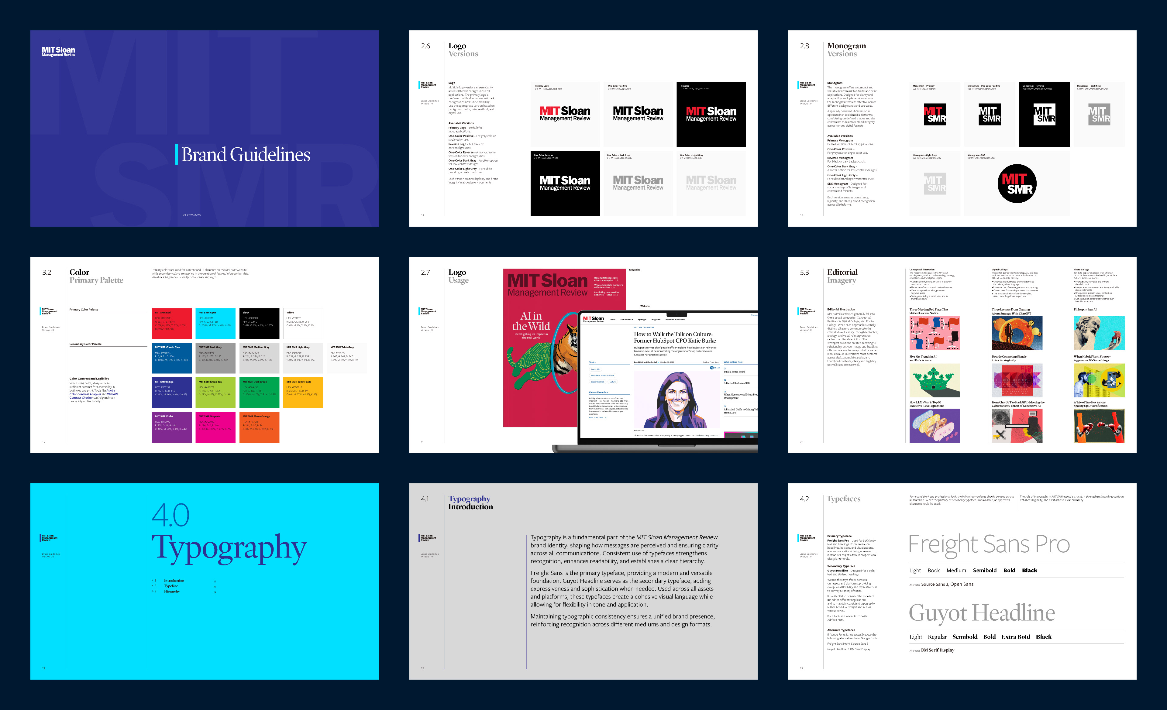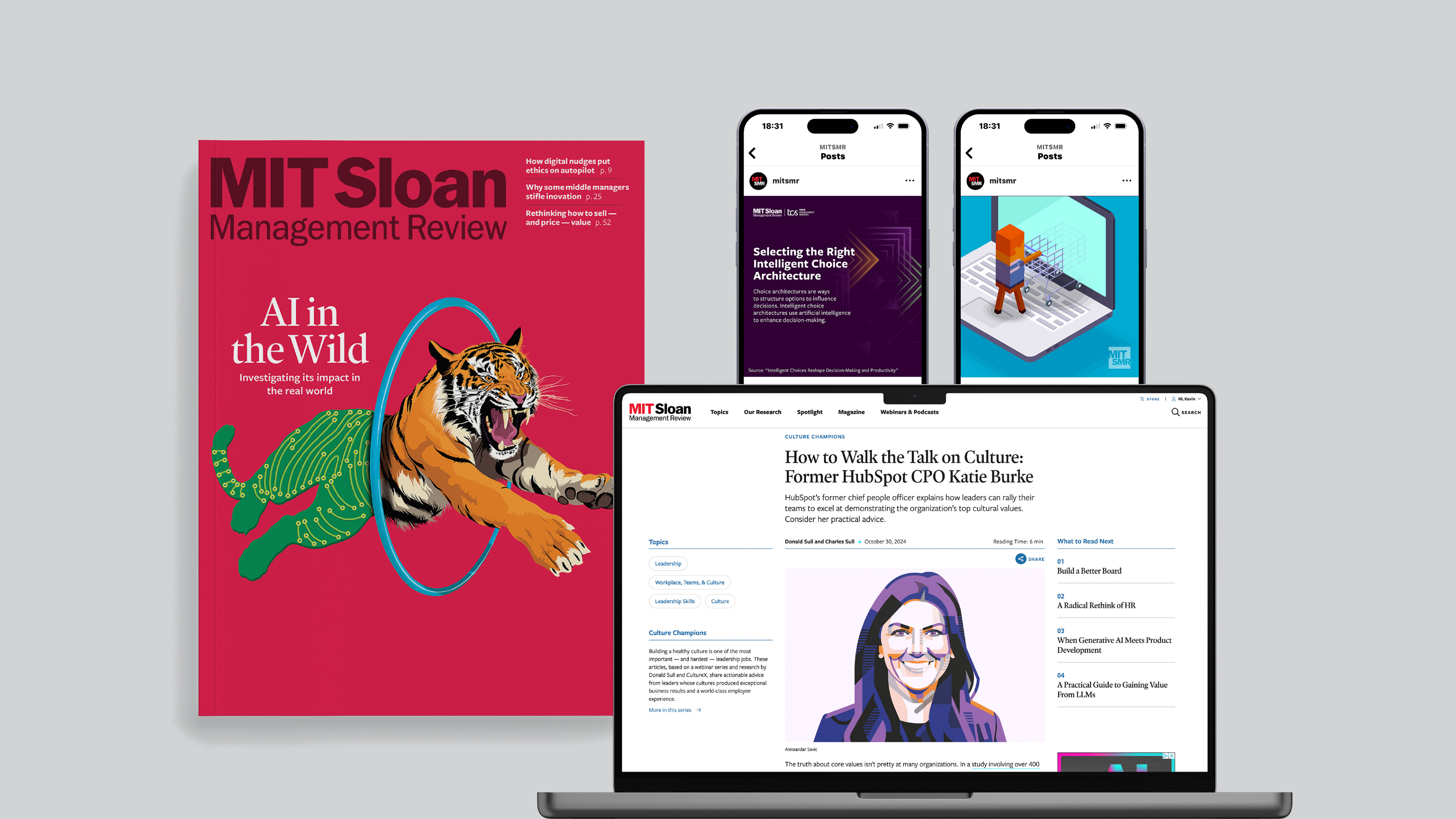
MIT Sloan Management Review was evolving beyond a traditional publishing model, expanding into digital toolkits, research guides, and paid experiences. With an identity that was inconsistently implemented across print and digital, establishing a unified visual foundation became increasingly important. I led the identity refresh from concept through implementation, designing a new logotype and monogram and developing a cohesive system for use across the organization.
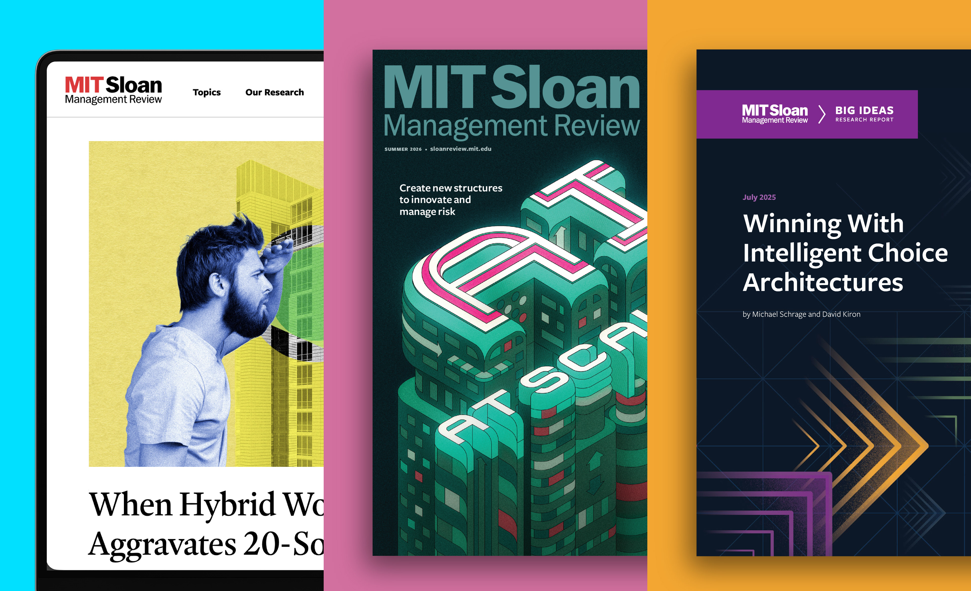
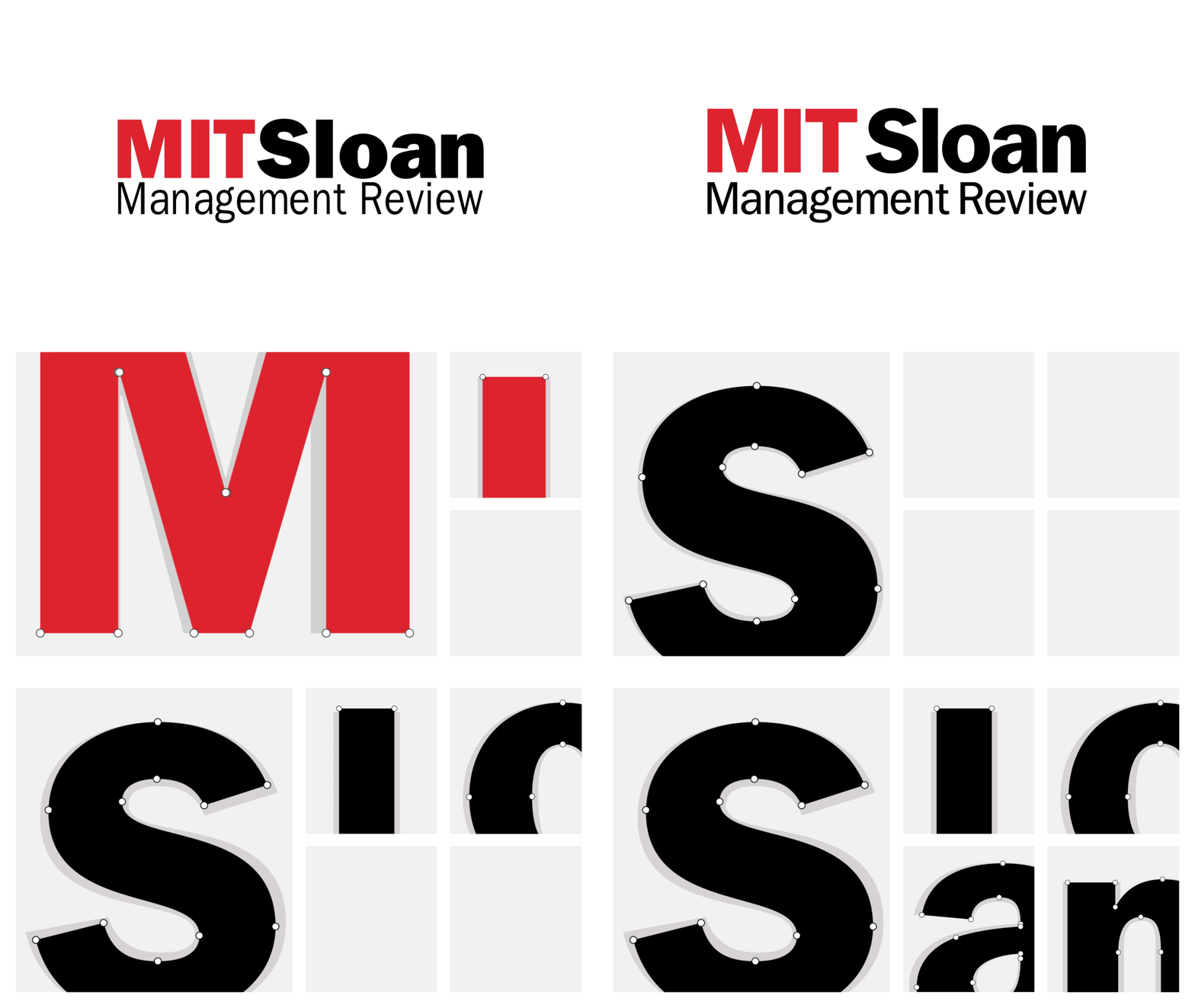

Years of inconsistent implementation resulted in multiple logotype versions. I created a unified logotype and updated monogram to establish a consistent identity across print and digital.